Archive

Tag Archives: capital allocation line

The basic implication of the CAPM is that the expected excess return of an asset is linearly related to the expected excess return on the market portfolio according to the following relation:

dh

This is simply a specific instance of a generic factor pricing model in which the factor is an excess return of a surrogate market portfolio and the test assets are all excess returns of risky assets. The betas are defined by regression coefficients 

rg

 and the model states that expected returns are linear in the betas :

fgh

From the expressions above, it is clear that there are two testable implications with regard to the validity of the CAPM:

[1] All regression intercepts should be individually equal to zero

[2] All regression intercepts should be jointly equal to zero

While there are numerous ways to estimate the model and evaluate the properties of its parameters, this post simply seeks to apply the Gibbons,Ross & Shanken methodology, in both its numerical and graphical incarnations, to a subset of the data. An attempt was made to download price and return data for the constituents of the SP500 since 1995. Data availability issues however constrained the number of assets under examination to 351 in total, with 216 monthly observations across said assets (as well as the index and T-Bill rate). The previous post summarised key return and risk statistics associated with each of these 351 assets with the help of the rpanel package (for control) and the PerformanceAnalytics package (for a host of measures). To implement the GRS test, one has to ensure that the number of test assets used in the process is less than the number of return observations.

For the sake of convenience the (updated) dashboards from the previous blog post are given below.

ikhjm

After estimating a conventional time-series regression for each risky asset, a dashboard of residual diagnostic plots can also be helpful.

dcdc

#Residual diag
windows()
layout(matrix(c(1,1,2,3,1,1,4,5,6,6,7,7),byrow=T,nrow=3,ncol=4))

if (interactive()) {
  draw <- function(panel) {
	par(mai=c(0,0.3,0.3,0.2))
	plot(main=paste('Time Series Regression :',colnames(monthly.ret)[panel$asset],'\n','Alpha= ',round(ts.list$alphas[panel$asset],3),'|| Beta= ',round(ts.list$betas[panel$asset],3)),x=exm.ret,y=ex.ret[,panel$asset],xlab='',ylab='',cex.main=0.85,cex.lab=0.7,cex.axis=0.8,lwd=1,cex=0.75)
	legend('topleft',legend=c('Actual','Fitted'),fill=c('black','red'),border.col=NA,bg=NA,cex=0.7,ncol=2)
	abline(ts.list$fit[[panel$asset]],col='red',lwd=2)

	par(mai=c(0,0.15,0.3,0.2))
	qqPlot(ts.list$fit[[panel$asset]],xlab='',ylab='',cex.lab=0.7,cex.axis=0.8,lwd=1,cex=0.75)

	par(mai=c(0,0.15,0.3,0.2))
	acf(main='',ts.list$resid[[panel$asset]],xlab='',ylab='',,cex.lab=0.7,cex.axis=0.8,lwd=1,cex=0.75)

	par(mai=c(0,0.15,0.3,0.2))
	chart.Histogram(border='black',ts.list$resid[[panel$asset]][,1,drop=T],methods = c( "add.density", "add.normal"),xlab='',ylab='',cex.main=0.85,cex.lab=0.7,cex.axis=0.8,lwd=1,cex=0.75)

	par(mai=c(0,0.15,0.3,0.2))
	plot(x=ts.list$fitted[[panel$asset]],y=ts.list$resid[[panel$asset]],xlab='',ylab='',cex.lab=0.7,cex.axis=0.8,lwd=1,cex=0.75)

	par(mai=c(0.3,0.3,0.3,0.2))
	plot(type='l',ts.list$resid[[panel$asset]],xlab='',ylab='',cex.lab=0.7,cex.axis=0.8,lwd=1,cex=0.75)
	legend('topright',legend=c('Residuals'),fill=c('black'),border.col=NA,bg=NA,cex=0.7,ncol=1)

	gq.p <- as.numeric(gqtest(ts.list$fit[[panel$asset]])[4])
	bp <- as.numeric(bptest(ts.list$fit[[panel$asset]])[4])

	sw <- as.numeric(shapiro.test(ts.list$resid[[panel$asset]])[2])
	jb <- as.numeric(jarque.bera.test(ts.list$resid[[panel$asset]])[3])

	dw<-as.numeric(durbinWatsonTest(ts.list$fit[[panel$asset]])[3])

	an <- c('Alpha','Beta','G-Quandt','')
	an1 <- c('B-Pagan','S-Wilk','J-Bera','D-Watson')

	te <- cbind(an,rbind(round(ts.list$alphas.p[panel$asset],3),round(ts.list$betas.p[panel$asset],3),round(gq.p,3),''))
	te1 <-cbind(an1,rbind(round(bp,3),round(sw,3),round(jb,3),round(dw,3)))
	tab <- cbind(te,te1)

	par(mai=c(0.2,0,0.3,0.1))
	TableMaker(row.h=c(1,3),apply(tab,2,rev),c('Measures','P-Values','Measures','P-Values'),strip=T,strip.col=c('red','green'),col.cut=0.10,alpha=0.6,border.col='lightgrey',text.col='black',header.bcol='darkblue',header.tcol='white',title='')
  	panel
}
	panel<- rp.control(asset=1)
	rp.slider(panel,asset,1,(ncol(monthly.ret)), action=draw,resolution=1,showvalue=TRUE)
}

oi
The residual diagnostics dashboard covers the conventional issues of [1] fitted vs actual data,[2] normality, [3] residual autocorrelation, [4] heteroskedasticity, [5] stationarity and [6] a table of p-values that are colour coded to reflect rejection (red) or non-rejection (green) of the null hypotheses associated with the named measure for the selected asset, at the 10% significance level. Asset selection is once again done via the rpanel package.

So far we have only concerned ourselves with the first testable implication of the CAPM in the context of a time series regression, namely the estimation and visualisation of residual diagnostics for each of the 351 test assets. The significance of the parameters for each model is assessed by comparing the test statistics to critical values or the p-values to chosen significance levels. For those assets that have an alpha-p-value less (greater) than 0.1, one would (not) reject the null hypothesis that their pricing error was equal to zero at the 10% level of significance.

The second testable implication of the CAPM in a time series framework relates to the condition of pricing errors (alphas) being jointly equal to zero across all test assets. Gibbons,Ross and Shanken (GRS for short) provide a useful methodology to test this condition under assumptions of residual normality,homoscedasticity and independence. The GRS test statistic I tried to replicate takes the following functional form :

kil

It appears that this statistic can be rewritten in such a way as to provide an intuitive graphical presentation of CAPM validity.More precisely, GRS show that the test statistic can be expressed in terms of  how far inside the ex post frontier the factor return is (excess market return in the CAPM).

gyj

Disequilibrium in markets implies that prices continue adjusting until the market clears. As prices move, so will asset returns and relative market values, affecting tangency- and market portfolio weights respectively. In the ideal CAPM universe, market and tangency portfolios will eventually converge and every investor will hold the tangency portfolio. Hence for the CAPM to hold, the market portfolio surrogate used in model estimation must not deviate too far, in a statistical sense, from the tangency portfolio.This code snippet calculates the Test statistic,p-value and plots the usual frontiers,assets and portfolios.

#Joint test (use only 200 assets because n.obs > n.assets otherwise)

t.per <- nrow(monthly.ret)
n.ass <- 200
t.term <- (t.per-n.ass-1)/n.ass

alphas <- ts.list$alphas[1:200]
res.cov <- NULL
for(i in 1:200)
{
	res.cov<-cbind(res.cov,ts.list$resid[[i]])
}
res.cov.m <- cov(res.cov)

term <- ((1+(mean(exm.ret)/apply(exm.ret,2,sd))^2)^(-1))
a.term <- t(alphas)%*%ginv(res.cov.m)%*%(alphas)

t.stat.g <- t.term*term*a.term
grs.pval<-pf(t.stat.g,200,15,lower.tail=T)

ret.set <- t(as.matrix(colMeans(cbind(bench.ret,monthly.ret[,1:200]))*100))
cov.set <- var(cbind(bench.ret,monthly.ret[,1:200])*100)

risky.asset.data <- list()
  risky.asset.data$mean.ret <- ret.set
  risky.asset.data$cov.matrix <- cov.set
  risky.asset.data$risk.free <- mean(rf.vec)

 base<-Frontiers(risky.asset.data)
 Frontier.Draw(risky.asset.data,base,rainbow(200),'new',lty=1,paste('Gibbons,Ross & Shanken Interpretation','\n','GRS statistic/pvalue :',round(t.stat.g,3),'/',round(grs.pval,3),'\n','For 200 assets'))
 CAL.Draw(risky.asset.data,base,'black',lty=1)

x <- seq(0,30,by=0.01)
lin <- mean(rf.vec)+((((mean(bench.ret)*100)-mean(rf.vec))/(apply(bench.ret,2,sd)*100))*x)
lines(x=x,lin,col='gold',lwd=1.5)
points(x=apply(bench.ret,2,sd)*100,y=mean(bench.ret)*100,col='black',cex=1,pch=17)
text('Market\nReturn',x=apply(bench.ret,2,sd)*100,y=mean(bench.ret)*100,col='black',cex=0.7,pos=1)

gh

The CAPM will always hold if the market proxy is mean variance efficient. For this condition to hold true, the surrogate for the market portfolio should lie on the capital market line, the efficient frontier when a risk free asset is introduced alongside the collection of risky assets. Since the market portfolio is not identifiable, the CAPM cannot be really tested. The market proxy used above, monthly returns to the SP 500 index, does not include factors such as [1] real estate and [2] human capital.


The previous post summarised the consequences on a tangency portfolio’s asset weights, returns and risks of extending the base case scenario (2 risky assets and 1 risk free asset) by including a third risky asset. The additional asset is constructed in such a way as to command a mean return and risk in excess of those provided by asset number 2 of the base case scenario, while simultaneously being less risky than asset number 1 of the base case,commanding a lower mean return with respect to the same until successive incarnations of that additional asset finally dominates base asset number 1 along both  dimensions of interest. By fixing the new asset’s risk to occupy an intermediate spot between the base assets but varying its mean return to increasingly higher levels,one would expect its optimal weight in the tangency portfolio to increase (as it does).

The two fund separation theorem decomposes any investment problem into [1] finding an optimal combination of risky assets and [2] finding the best combination of this optimal risky portfolio and the risk free asset. While the first part of the problem can be addressed independently across different investors without accounting for individual preferences,the latter part of the investment problem must be addressed in relation to the trade offs between risk and return that an individual is willing to incur. As we have seen several posts ago, individual preferences can be captured using indifference curves and utility functions. The total optimal portfolio, itself a combination of the optimal risky portfolio and the risk free asset, emerges at the tangency between preferences (as governed by utility functions and indifference curves) and investment opportunities (as governed by the capital allocation line that connects the riskless fund with the optimal risky fund).

While the previous post was concerned with issues surrounding the optimal risky portfolio, this post will concentrate on the total optimal portfolio. The objective here is to track how optimal asset weights change across individuals with different risk preferences using the framework defined in previous posts. Each investor will be associated with (and identified by) a unique risk aversion parameter ranging from 1 to 5 with increments of 0.5 separating successive agents. Intuitively, a higher risk aversion parameter should be associated with a total optimal portfolio that is less invested in the optimal risky fund than the riskless fund. The converse should be true for lower values of the risk aversion parameter.

#####################################################################
#Supplement 3
#####################################################################

idx <- seq(1,5,by=0.5)
lay.mat <- matrix(c(1,1,1,2,1,1,1,2,1,1,1,2,3,3,3,4),4,4,byrow=T)
lay.h <- c(0.20,0.20,0.2,0.3)
lay.w <- rep(1,4)
n.assets <- 15
front.col <- adjustcolor(col=rainbow(n.assets),alpha.f=1)
rf.col <- adjustcolor(col='grey',alpha.f=1)

total.opt.weights <- NULL
sim.opt <- simulate.assets(n.assets)
sim.mvf <- MVF(sim.opt)
cal.opt <- CAL.line('Sharpe',sim.opt,sim.mvf)
DrawCAL(cal.opt,sim.opt,sim.mvf,legend.draw=T,lay.mat,lay.h,lay.w,main.title='Frontiers Plot\nwith optimal portfolios')
DrawMVF(sim.mvf,FALSE,NULL,NULL)

for(i in 1:length(idx)){
 utility.contours('Sharpe',sim.opt,idx[i],sim.mvf)
}

expected.ret <- sim.mvf[[4]][1]
risky.var <- (sim.mvf[[4]][2])^2
risk.free <- sim.opt[[4]]
opt.risky.alloc <- matrix((expected.ret-risk.free)/(idx* risky.var),ncol=1)
opt.riskfree.alloc <- matrix((1-opt.risky.alloc),ncol=1)
opt.port.ret <- risk.free+opt.risky.alloc*(expected.ret-risk.free)
opt.port.risk <- (opt.risky.alloc^2)*risky.var
opt.utility <- opt.port.ret-(0.5*idx*opt.port.risk)

z.data <- list()
 z.data$mean.ret <- matrix(sim.opt[[5]],nrow=1,ncol=n.assets,dimnames=list(c('mean return'),c(paste('Asset',1:n.assets))))
 z.data$cov.matrix <-as.matrix(sim.opt[[2]],nrow=n.assets,ncol=n.assets,dimnames=list(c(paste('Asset',1:n.assets)),c(paste('Asset',1:n.assets))))
 z.data$risk.free <- risk.free

 front<-Frontiers(z.data)
 risky.weights <- matrix(front$tang.weights,nrow=n.assets,ncol=1,dimnames=list(c(paste('Asset',1:n.assets)),c('tangency weight')))
for(i in 1:length(opt.risky.alloc)){
 total.opt.weights <-cbind(total.opt.weights,opt.risky.alloc[i]*risky.weights)
}
total.opt.weights <- t(total.opt.weights)

par(mai=c(0.65,0,0.55,0.15))
l <- length(idx)
plot(col='green',pch=15,bty='o',x=opt.riskfree.alloc,y=1:l,cex=0.75,cex.axis=0.8,cex.lab=0.8,cex.main=0.8,yaxt='n',main='Optimal Weight\nrisk free rate',xlab='Weight',ylab='')
polygon(y=c(1:l,l:1),x=c(rep(0,l),rev(opt.riskfree.alloc)),col=rf.col)
text(x=opt.riskfree.alloc,y=1:l,idx,cex=0.7,col='darkgreen',pos=1)

par(mai=c(0.65,0.53,0.15,0.3))
transition(total.opt.weights,colours=c(front.col),xlab='Risk aversion parameter',ylab='Asset weights',main='Weight transition map - Risky assets')

par(mai=c(0.65,0,0.10,0.15))
plot(1, type="n", axes=F, xlab="", ylab="",bty='o',xaxt='n',yaxt='n')
legend('center',fill=c(front.col,rf.col),legend=c(paste('Asset',1:n.assets),'Rf-asset'),ncol=2,bg='white',bty='n',cex=0.85,title='Total\nPortfolio Weights')

kk
In the code above,we simulate 15 random assets, plot them in the risk/return space along with the minimum variance frontier that they span,the optimal risky portfolio (tangency portfolio) that emerges from the markowitz procedure,the capital allocation line (CAL) that connects the riskless fund to the tangency portfolio, as well as the optimal total portfolios that emerge as points on the CAL. Since each investor is presumed to face the same universe of risky assets, the differences across total optimal portfolios across various agents depend on the associated risk aversion parameter.

The dashboard of plots follows.
ll
vgfll
While both transition maps are defined relative to the risk aversion parameter,I have separated the risky asset weights and riskless asset weights to better emphasise the point of the two fund separation theorem as well as making visualisation less muddy. The results corroborate the intuition that greater values of the risk aversion parameter are associated with increasing proportions of the total optimal portfolio being invested in the riskless fund. The transition function was adapted from alphaism and systematic investor.

To arbitrarily round off this series of posts, along which a sketch of the traditional asset pricing framework has been attempted,  a dashboard of simple plots shall be made to summarise some of the implications of extending the 2-asset base case with an additional risky asset. Starting with the base case of 2 risky assets and one riskless asset, we shall once again draw the minimum variance frontier as well as the capital allocation line to locate the tangency portfolio. A pie chart will conveniently summarise the tangency portfolio weights associated with these 2 assets. The base case with two risky assets will then be extended by including additional risky assets, one at a time , holding the variance of each asset’s return constant while varying the mean return of that asset. Assets will be added sequentially to the base case, so that at any time only 3 risky assets are in the universe along with one riskless asset. Barcharts will illustrate the returns and risks on tangency portfolios for each of the extended scenarios. An area chart will summarise how asset weights vary in tangency portfolios across scenarios.

###################################################################################################
###################################################################################################
#Supplement 2
###################################################################################################
###################################################################################################&lt;/pre&gt;
idx &lt;- seq(from=-0.5,to=0.2,length.out=10)
weights.mat &lt;-ret.mat &lt;- var.mat &lt;- NULL
col &lt;- adjustcolor(col=c('dark green','green','light green'),alpha.f=0.5)
front.col &lt;- rainbow(length(idx))

#base case
 two.asset.data &lt;- list()
 two.asset.data$mean.ret &lt;- matrix(c(0.800,0.0500),nrow=1,ncol=2,dimnames=list(c('mean return'),c('asset 1','asset 2')))
 two.asset.data$cov.matrix &lt;- matrix(c(0.0256,0,0,0.0144),nrow=2,ncol=2,byrow=T,dimnames=list(c('asset 1','asset 2'),c('asset 1','asset 2')))
 two.asset.data$risk.free &lt;- 0.02

base&lt;-Frontiers(two.asset.data)

windows()
 layout(matrix(c(1,1,1,2,1,1,1,3,1,1,1,4,5,5,5,5),4,4,byrow=T),height=c(0.20,0.20,0.2,0.3))
 par(mai=c(0.7,0.7,0.3,0.2))
 Frontier.Draw(two.asset.data,base,'red','new',lty=1,'Base Case\nextended with new asset')
 CAL.Draw(two.asset.data,base,'red',lty=1,tit=0)
 legend('bottom',fill=front.col,legend=round(idx,3),ncol=5,bg='white',bty='n',cex=0.9,title='New asset (with mean defined relative to base portfolio returns)')
 legend('topleft',legend=c('Tangency portfolios','Assets'),pch=c(17,16),bg='white',bty='o',cex=0.9,ncol=1)
 abline(h=-0.065)
 abline(h=-0.12)

for(i in 1:length(idx))
 {
 z.data &lt;- list()
 z.data$mean.ret &lt;- matrix(c(0.800,0.0500,0.8+idx[i]),nrow=1,ncol=3,dimnames=list(c('mean return'),c('asset 1','asset 2','asset 3')))
 z.data$cov.matrix &lt;- matrix(c(0.0256,0,0,0,0.0144,0,0,0,0.02),nrow=3,ncol=3,byrow=T,dimnames=list(c('asset 1','asset 2','asset 3'),c('asset 1','asset 2','asset 3')))
 z.data$risk.free &lt;- 0.02

 front&lt;-Frontiers(z.data)
 Frontier.Draw(z.data,front,col=front.col[i],'add',2,legend=1)
 CAL.Draw(z.data,front,col=front.col[i],lty=1,tit=0)

weights.mat &lt;- cbind(weights.mat,front$tang.weights)
 ret.mat &lt;- cbind(ret.mat,front$tang.ret)
 var.mat &lt;- cbind(var.mat,front$tang.risk)
 }

rownames(weights.mat) &lt;- c('Asset 1','Asset 2','Asset 3')
 colnames(ret.mat) &lt;- round(idx,2)
 colnames(var.mat) &lt;-round(idx,2)
 weights.mat &lt;- t(weights.mat)
 base.weights &lt;- base$tang.weights

ret.mat &lt;- matrix(ret.mat)
 var.mat &lt;- matrix(var.mat)

par(mai=c(0.3,0.3,0.3,0.3))
 pie(cex.main=0.75,main='Base case\ntangency weights',base.weights,col=col[1:2],labels=c(paste('Asset 1\n',base.weights[1]*100,'%'),paste('Asset 2\n',base.weights[2]*100,'%')),cex=0.75,radius=0.85)

par(mai=c(0.5,0.3,0.3,0.3))
 barplot(axes=T,beside=T,horiz=F,ret.mat,cex.axis=0.75,cex.lab=0.75,cex.main=0.75,main='Tangency\nPortfolio Returns',col=front.col,xaxlab=c(1:10))

 par(mai=c(0.7,0.3,0.2,0.3))
 barplot(axes=T,beside=T,horiz=F,var.mat,cex.axis=0.75,cex.lab=0.75,cex.main=0.75,main='Tangency\nPortfolio Risk',col=front.col,xlab='Assets')

par(mai=c(0.7,0.7,0,0.3))
 stackpoly(xlim=c(1,length(idx)+1.5),axis4=F,cex.main=0.85,cex.lab=0.75,cex.axis=0.75,weights.mat,xaxlab=round(idx,2),border='white',stack=F,xlab='Deviations from base',ylab='Weights',lwd=1,col=col)
 legend('right',fill=col,legend=colnames(weights.mat),ncol=1,bg='white',bty='n',cex=0.85,title='Tangency\nPortfolio Weights')

The resulting dashboard of plots follows.

gg

The vertical alignment of the new assets implies that we are varying the mean returns while keeping their risk constant. Each of the minimum variance frontiers and capital allocation lines are drawn for 3 risky assets and one riskless asset. The mean return of each new asset is chosen as a deviation from the mean return of the second risky asset (Asset 2) of the base case scenario. The inputs associated with the assets in the base case scenario remain unchanged throughout. By varying only the mean returns of the additional risky assets and holding constant all other factors across the 10 scenarios, we can examine how optimal asset weights evolve according to return deviations. In the context of the base case scenario, the optimal risky portfolio would be 93.6% invested in asset 1 and 6.4% invested in asset 2. This is intuitive given that asset 1 has a mean return of 0.8 and a risk of 0.0256 while asset 2 enjoys a mean return of 0.05 and a lower risk of 0.0144. Evidently the lower risk of asset 2 does not sufficiently compensate for the small return it generates relative to asset 1 (0.05 vs 0.80). Visually this is corroborated by the proximity of the optimal risky portfolio relative to asset 1 on the MVF spanning the 2 risky assets in the frontier plot. Every time we add a new risky asset to the scenario, we ensure that it has a lower negative deviation or a higher positive deviation from asset 2’s mean return ( essentially from -0.5 to +0.2 relative to the second asset’s mean return). The risk of each and every one of those assets lies between those of the base assets (as evinced from the frontier plot). The barplots confirm the intuition that by adding risky assets with increasingly higher mean returns to the base case scenario, the return on the tangency portfolio increases. Similarly, as we reduce the negative deviations/enhance the positive deviations of the third asset’s mean return relative to the return of the base asset, the optimal weight shifts from base assets to asset 3.

The previous post addressed the second element of the two fund theorem, the allocation of capital between the risky portfolio (which was constrained to hold only one asset) and the riskfree asset. This post will concentrate on locating the optimal risky portfolio when the number of risky assets is extended to 25 simulated data points. The possible set of expected returns and standard deviations for different combinations of the simulated risky assets will be plotted along the Minimum Variance Frontier. Every point on this contour is a combination of risky assets that minimise portfolio risks for a given level of portfolio returns.


[The Minimum Variance Frontier]

The basic intuitions can be illustrated using the case of two risky assets. The expected return on such a portfolio would simply be the weighted average of individual asset returns

m1

The variance of such a portfolio depends on the covariance and variances of the 2 assets concerned. 

m2

The covariance itself can be decomposed in terms of the correlation coefficient and standard deviations.

m3

By varying the weights in each asset and noting the corresponding expected portfolio returns and risk, the MVF can be traced. Two functions were written to deal with such issues MVF and DrawMVF.

#############################################################################
#
# Mean Variance Frontier
#
#############################################################################

MVF <- function (risky.assets){

	raw.ret <- risky.assets[[1]]
	n <- ncol(raw.ret)
	min.ret <- min(risky.assets[[5]])
	max.ret <- max(risky.assets[[5]])
	var.cov <-risky.assets[[2]]
	n.port = 200
	risk.free <- risky.assets[[4]]
	risky.port <- list()

	if(n<2){
        print('Please specify more than one asset when using the [simulate.assets] function')
	} else if(n>1){
			target.returns <- seq(min.ret,max.ret,length.out=n.port)
			mvp <- vector('list',n.port)
		  min.var.frontier <- matrix(0,dimnames=list(c(seq(1,n.port)),c('Portfolio Return','Portfolio Risk','Sharpe Ratio',1:n)),nrow=n.port,ncol=n+3)

		  for(i in 1:n.port){
		  	mvp[[i]]<-portfolio.optim(x=raw.ret,pm=target.returns[i],riskless=F,shorts=F)
		  	min.var.frontier[i,] <- c(mvp[[i]]$pm,(mvp[[i]]$ps),(mvp[[i]]$pm-risk.free)/(mvp[[i]]$ps),mvp[[i]]$pw)
		  }

		  max.sharpe.port <- min.var.frontier[which.max(min.var.frontier[,3]),]
		  global.min.var.port <- min.var.frontier[which.min(min.var.frontier[,2]),]

		  risky.port[[1]] <- min.var.frontier
		  risky.port[[2]] <- target.returns
		  risky.port[[3]] <- raw.ret
		  risky.port[[4]] <- max.sharpe.port
		  risky.port[[5]] <- global.min.var.port

    return(risky.port)

   }
}

mn

#############################################################################
#
# Drawing the mean variance frontier
#
#############################################################################

DrawMVF <- function(risky.portfolio,add.frontiers,ind,total.num){

	port.return <- risky.portfolio[[1]][,1]
	port.risk <- risky.portfolio[[1]][,2]
	port.sharpe <- risky.portfolio[[4]][2:1]
	min.var.port <- risky.portfolio[[5]][2:1]

	if(add.frontiers==TRUE){
		col.ind <- rainbow(total.num)
		lines(x=port.risk,y=port.return,col=col.ind[ind],lwd=1.5,type='l')
	} else if(add.frontiers==FALSE){
		  lines(x=port.risk,y=port.return,col='black',lwd=1.5,type='l')
	    points(x=min.var.port[1],y=min.var.port[2],col='purple',cex=1,pch=11)

	}

}

h
To operationalise some of the issues so far, let’s simulate random asset returns for 25 securities, plot them in the risk/return space along with the MVF that these assets trace.

o

#Mean variance efficiency

sim.opt <- simulate.assets(25)
sim.mvf <- MVF(sim.opt)
cal.opt <- CAL.line('Sharpe',sim.opt,sim.mvf)
DrawCAL(cal.opt,sim.opt,sim.mvf,legend.draw=TRUE)
utility.contours('Sharpe',sim.opt,1.5,sim.mvf)
DrawMVF(sim.mvf,FALSE,NULL,NULL)

kk

Once the MVF has been traced, the optimal portfolio of risky simulated assets can be located. Essentially, the objective is to find one collection of risky asset weights that is superior to any other combination of risky assets according to some risk adjusted performance measure. The standard performance measure used is the Sharpe ratio which adjusts the excess expected portfolio return by the standard deviation of portfolio returns. Graphically, since the slope of the CAL is the Sharpe ratio,the optimal risky portfolio is simply the tangency portfolio which results when the CAL with the highest slope touches the MVF. This is shown in the plot above. Intuitively, one could have drawn the CAL with respect to any other point on the MVF but the Sharpe ratio would be suboptimal. Connecting the risk free asset with the global minimum variance portfolio would result in a CAL that has a negative slope, and hence a negative Sharpe ratio, implying that the risk free asset provides a better return than the global minimum variance portfolio (in our example).  

Mathematically, the objective is to find a set of risky asset weights that maximise the Sharpe ratio:

mkh

Instead of using optimisation packages to locate the Sharpe-ratio-maximising-portfolio, I simply computed the Sharpe measure for every point on the MVF and extracted the subset of weights for which the Sharpe ratio was maximal. The result appears to be correct since it corroborates with more advanced packages such as fPortfolio.

The Two-fund separation theorem of Modern Portfolio Theory states that the investment problem can be decomposed into the following steps:

  1. Finding the optimal portfolio of risky assets
  2. Finding the best combination of this optimal risky portfolio and the risk free asset.

With regard to the first point, the optimal portfolio of risky assets is simply the set of risky asset weights that maximise the Sharpe ratio (or of course some other performance measure)

With regard to the second point, the total optimal portfolio, one that is invested in the risk free rate and the risky optimal portfolio, depends on the manner in which individual risk preferences (as embodied in the utility function) intersect with investment opportunities (as embodied in th CAL).

ll

As before, the total optimal portfolio results where the highest available indifference curve for a given level of risk aversion meets the CAL with the highest Sharpe ratio (or slope). Again, an individual with a risk aversion of 0.5 would allocate more of his capital to the optimal risky portfolio than an individual with a risk aversion parameter of 1.5.jku

An investor who has a very low risk aversion parameter would borrow at the risk free rate and invest the borrowed funds along with own capital in the optimal risky portfolio. The resulting total portfolio would lie to the right of the optimal risky portfolio.

ghkj

According to the Two-fund separation theorem of Modern Portfolio Theory, the investment problem can be decomposed into the following steps:

  1. Finding the optimal portfolio of risky assets
  2. Finding the best combination of this optimal risky portfolio and the risk free asset.

This post will concentrate on the second issue first. The problem of finding an optimal risky portfolio will be addressed in the next post.

[The Capital Allocation Line]

To simplify the procedure for finding the optimal combination of the risk free and the risky funds, one can first consider the return on a portfolio consisting of one risky asset and a risk free asset. The return on such a portfolio is simply:

ret

The variance of this combined portfolio is given by:

vaa

These two results can be combined to yield the following expression :

cal

This is the Capital Allocation Line (CAL) and represents the set of investment possibilities created by all combinations of the risky and riskless asset. The price of risk is the return premium per unit of portfolio risk and depends only on the prices of available securities. This ratio is also known as the Sharpe ratio. To illustrate how the CAL works, let us first set up some functions to [a] simulate random asset returns from a normal distribution and [b] calculate and draw the CAL connecting one risky asset with the risk free rate. These functions correspond to simulate.assets,CAL.line and DrawCAL as shown below.

#############################################################################
#
# Simulate asset returns from a normal distribution
#
#############################################################################

simulate.assets <- function(num.assets){
	ret.matrix <- matrix(dimnames=list(c(seq(1,100)),c(paste('Asset',1:num.assets))),(rep(0,num.assets*100)),nrow=100,ncol=num.assets,byrow=FALSE)
	shock <- matrix(dimnames=list(c(seq(1,100)),c(paste('Asset',1:num.assets))),(rep(0,num.assets*100)),nrow=100,ncol=num.assets,byrow=FALSE)
	for(i in 1:num.assets){
    	ret.matrix[,i]=rnorm(100,mean=runif(1,-0.8,0.2),sd=runif(1,0.8,2))
	    shock[,i] <- rnorm(100,colMeans(ret.matrix)[i],apply(ret.matrix,2,sd)[i])
	}
	sd.matrix <- apply(ret.matrix,2,sd)
	var.matrix <- var(ret.matrix)
	risk.free <- 0.02
	mean.ret <- colMeans(ret.matrix)
	sim.assets <- list(ret.matrix,var.matrix,sd.matrix,risk.free,mean.ret,shock)
	return(sim.assets)
}


#############################################################################
#
# Capital Allocation Line
#
#############################################################################

CAL.line <- function(type,risky.assets,optimised.portfolio){

	if(type=='Assets' && is.null(risky.assets)==FALSE){
    	num.assets <- ncol(risky.assets[[1]])
	    asset.returns <- colMeans(risky.assets[[1]])
	    asset.risk <- risky.assets[[3]]

	} else if (type=='Sharpe' && is.null(optimised.portfolio)==FALSE){
	    num.assets <- 1
	    asset.returns <- optimised.portfolio[[4]][1]
	    asset.risk <- optimised.portfolio[[4]][2]
	}

	total.risk <- seq(0,2,by=0.01)
	risk.free <- risky.assets[[4]]

	CAL.complete <- vector('list',num.assets)
	price.risk <-c()
	total.return <-matrix(rep(0,length(total.risk)*num.assets),nrow=length(total.risk),ncol=num.assets)

	 for(i in 1:num.assets){
	 	price.risk[i] <- (asset.returns[[i]]-risk.free)/asset.risk[i]
	    total.return[,i] <- risk.free+(price.risk[i]*total.risk)
	 	CAL.complete[[i]]<-cbind(total.risk,total.return[,i])
	 	colnames(CAL.complete[[i]]) <- c('Total Risk','Total Return')
	}
return(CAL.complete)
}


#############################################################################
#
# Draw Capital allocation Line (s)
#
#############################################################################

DrawCAL<-function(CAL,risky.assets,optimised.portfolio,legend.draw){

	num.lines <- length(CAL)
	num.assets <- ncol(risky.assets[[1]])
	plot.x.max <- max(risky.assets[[3]])+0.2
	plot.y.min <- min(risky.assets[[5]])-1
	plot.y.max <- max(risky.assets[[5]])+1

	windows()
	par(xaxs="i", yaxs="i")

	if(num.lines==1 && is.null(optimised.portfolio)==FALSE){
	  plot(xlab='Standard Deviation',ylab='Expected Return',ylim=c(plot.y.min,plot.y.max),xlim=c(0,plot.x.max),CAL[[1]],col='red',type='l',main='Capital Allocation Line',cex.main=0.85,cex.lab=0.75,cex.axis=0.75,lwd=2)
	  points(x=optimised.portfolio[[4]][2],y=(optimised.portfolio[[4]][1]),type='p',pch=9,col='dark blue',cex=1)
	} else if(num.lines==1 && is.null(optimised.portfolio)==TRUE){
	   plot(xlab='Standard Deviation',ylab='Expected Return',ylim=c(plot.y.min,plot.y.max),xlim=c(0,plot.x.max),CAL[[1]],col='red',type='l',main='Capital Allocation Line',cex.main=0.85,cex.lab=0.75,cex.axis=0.75,lwd=2)
	} else if(num.lines>1){
	   plot(xlab='Standard Deviation',ylab='Expected Return',ylim=c(plot.y.min,plot.y.max),xlim=c(0,plot.x.max),CAL[[1]],col='red',type='l',main='Capital Allocation Line',cex.main=0.85,cex.lab=0.75,cex.axis=0.75,lwd=2)
	   for(i in 2:num.lines){
	      lines(CAL[[i]],col='red',type='l',lwd=2)
	    }
	}
	points(x=0.01,y=risky.assets[[4]],type='p',pch=15,col='dark green',cex=1)
    points(x=risky.assets[[3]],y=risky.assets[[5]],type='p',pch=17,col='blue',cex=0.75)
    text(labels=1:num.assets,x=risky.assets[[3]],y=risky.assets[[5]],pos=3,col='blue',cex=0.65)
    legend(plot=legend.draw,title='Legend','bottomleft',pch=c(15,17,3,3,8,9,11),col=c('dark green','blue','red','dark orange','black','dark blue','purple'),legend=c('Risk free asset','Risky assets','Capital Allocation Line','Indifference Curves','Optimal Total Portfolio','Max Sharpe Portfolio','Min Variance Portfolio'),ncol=1,bg='white',bty='n',border='black',cex=0.65)
 }

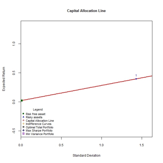
To Implement these functions,let’s first simulate the data for one asset with100 timeseries observations drawn from a normal distribution with a mean and standard deviation that are themselves drawn from a uniform distribution. A risk free rate is also pre-specified at 0.02 and a simple CAL is drawn to connect these 2 assets as per the expression above.


#Capital Allocation Line

sim.one <- simulate.assets(1)
cal.one <-CAL.line('Assets',sim.one,NULL)
DrawCAL(cal.one,sim.one,NULL,legend.draw=TRUE)

c1

As mentioned above, the CAL is simply the combination of the risk free asset and the risky portfolio (which as of yet has been constrained to contain a single asset). The slope of the CAL is the Sharpe ratio and depicts the amount of excess portfolio return per unit of portfolio risk we can expect. Since every point on the CAL is an investment possibility of allocating wealth between the riskless asset and the risky portfolio (single asset in this case), what determines which of these combinations is optimal? The amount of capital an investor places in the risk free asset versus the risky portfolio is determined by the preferences for risk and return as captured by the utility function examined previously.

Mathematically, the objective of an investor is to find the weights of the risky portfolio that maximises the utility of portfolio returns. Or more succinctly :

bv

The optimal weight for the risky portfolio is given by :

bvv

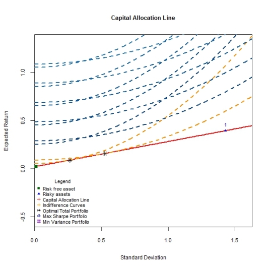
The optimal weight in the risk free asset is then simply (1-w*). Since the indifference curve and the CAL are drawn in the same risk/return space, let’s superimpose an indifference curve with a risk aversion parameter of 1 on the CAL as follows.

utility.contours('Assets',sim.one,1,NULL)

bv

The total optimal portfolio results where investment opportunities as represented by the CAL meet the highest attainable indifference curve as represented by the orange contour. With a risk aversion parameter of 1, the investor exhibits his distaste for risk and places a large weight on the risk free asset versus the risky asset or portfolio. Another investor who is less risk averse (a risk aversion parameter of 0.5) would invest a larger portion of his capital in the risky asset versus the risk free asset and hence the total optimal portfolio is located closer to the simulated risky asset as below.

c2

While the investor prefers to make investments consistent with the risk/return opportunities towards the northwestern corner of the plot – where blue indifference contours are drawn – the available investments as per the capital allocation line do not permit this.

So far we have constrained our risky portfolio to contain only one asset. There is nothing stopping us from simulating multiple risky assets and drawing the CAL between the risk free asset and each of these simulated assets as below.

sim.mult <- simulate.assets(20)
cal.mult <- CAL.line('Assets',sim.mult,NULL)
DrawCAL(cal.mult,sim.mult,NULL,legend.draw=T)

c3

This post has dealt with the second half of the two fund theorem according to which any investment problem can be addressed by combining the risk free asset (riskless fund) and the risky portfolio (risky fund). So far we have constrained the number of assets contained in the risky portfolio. The task of finding the optimal risky portfolio, the second half of the theorem, shall be addressed in the next post.